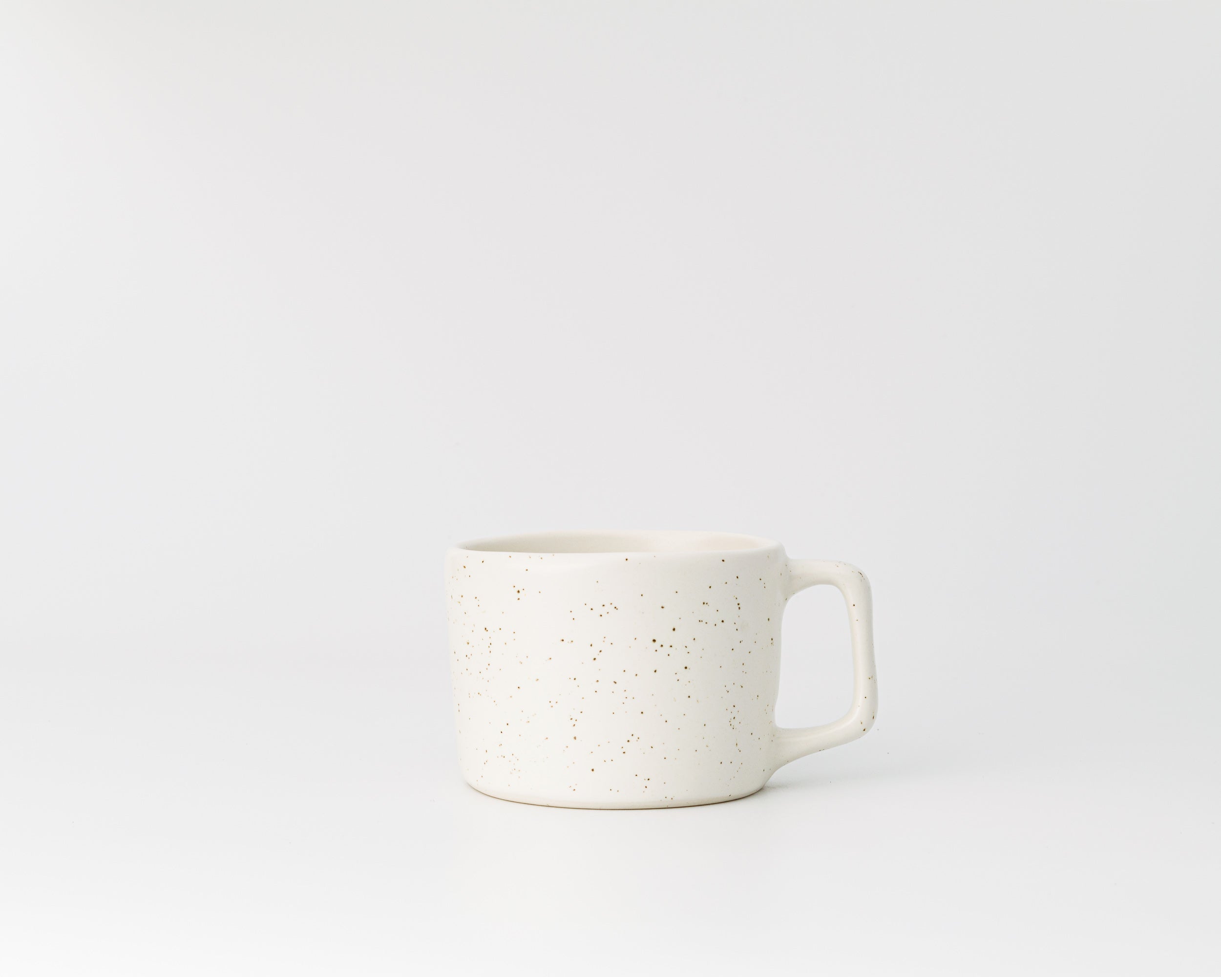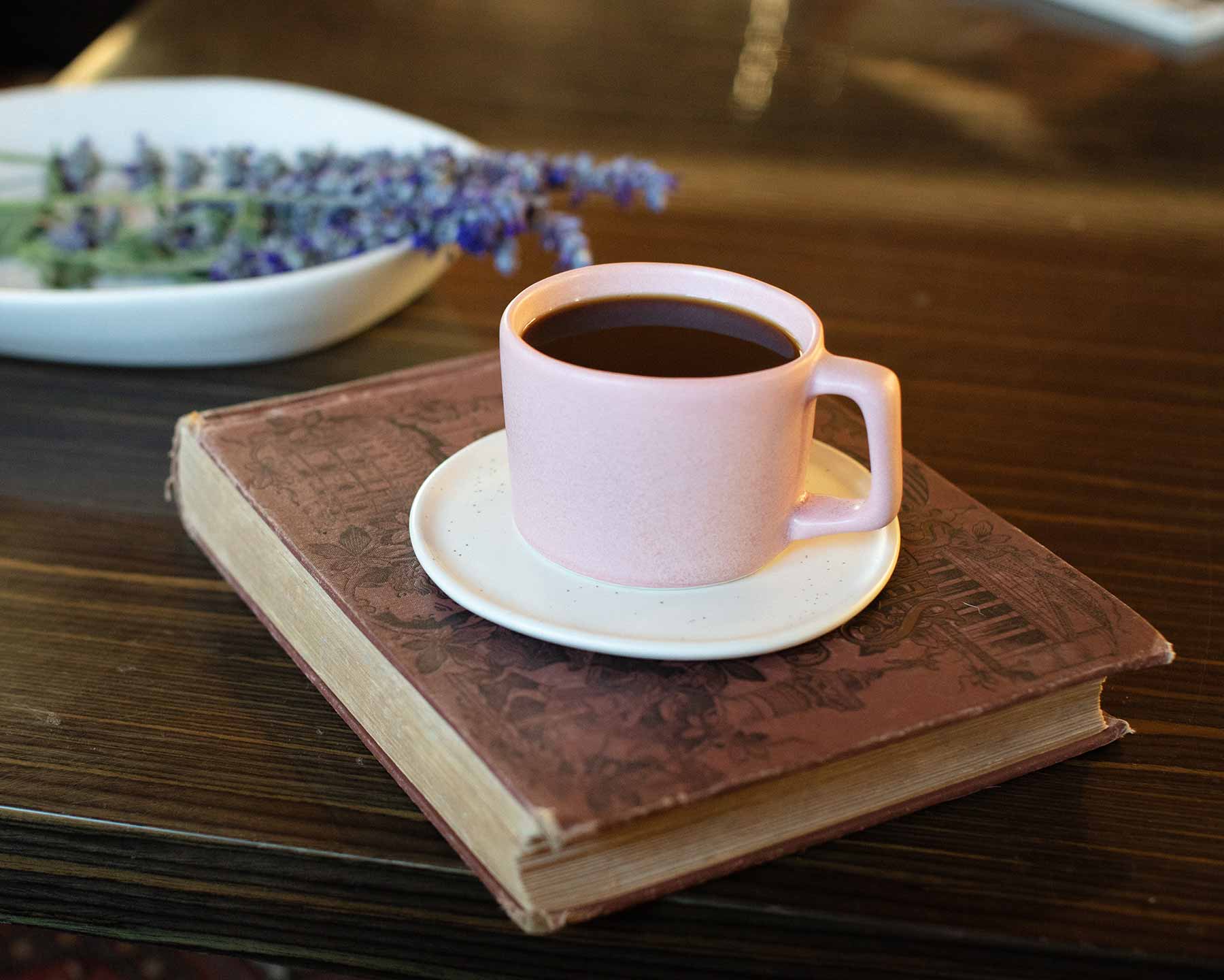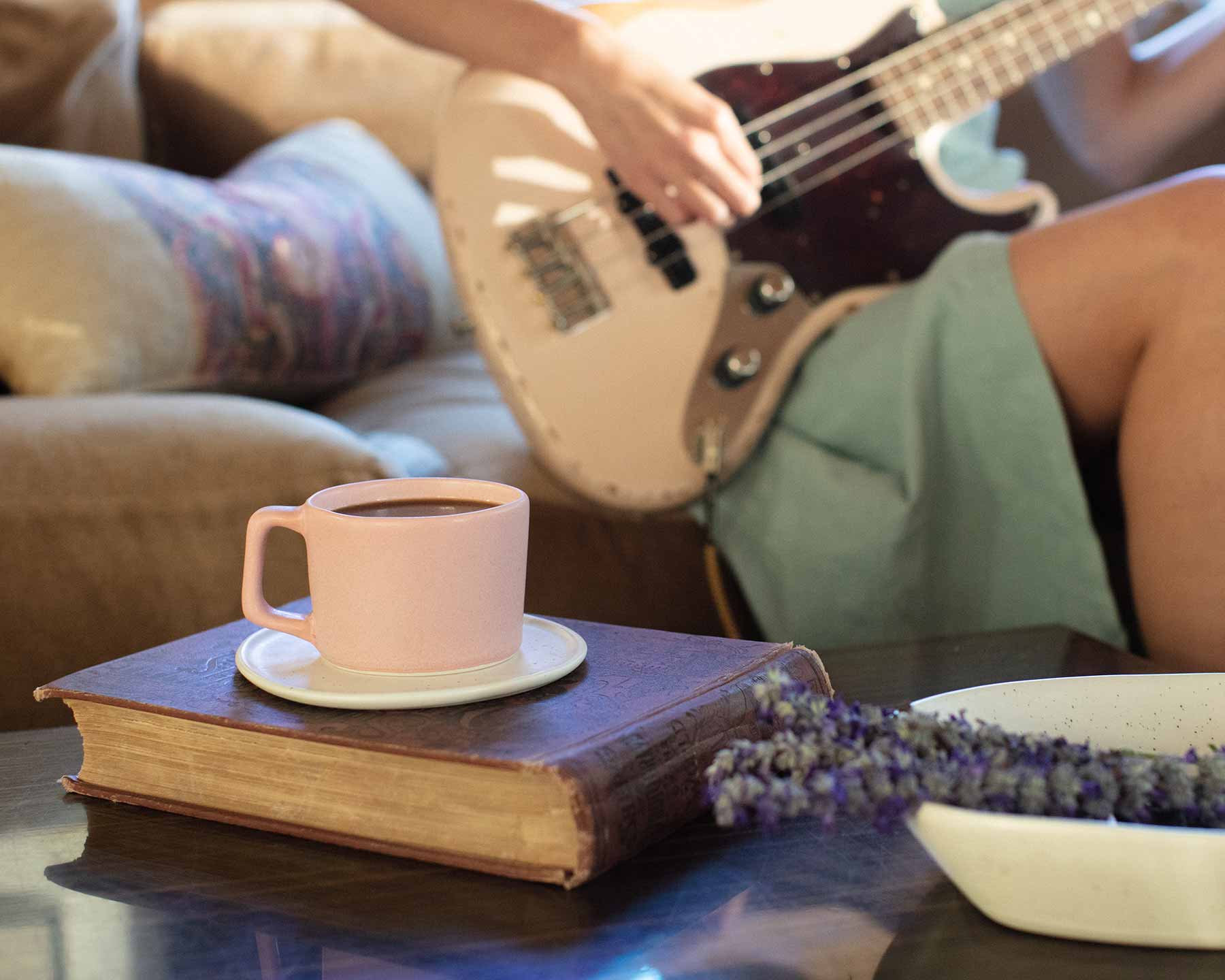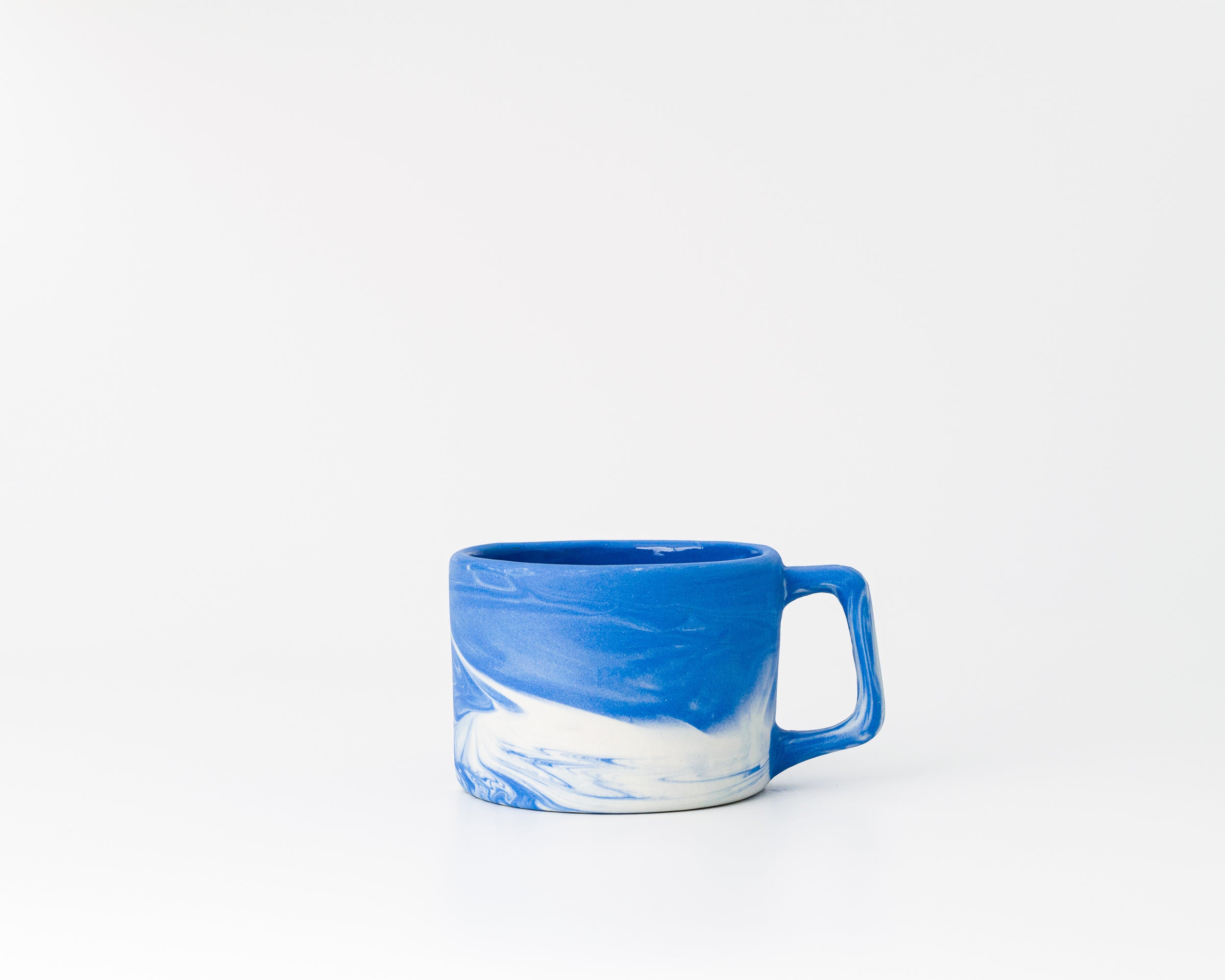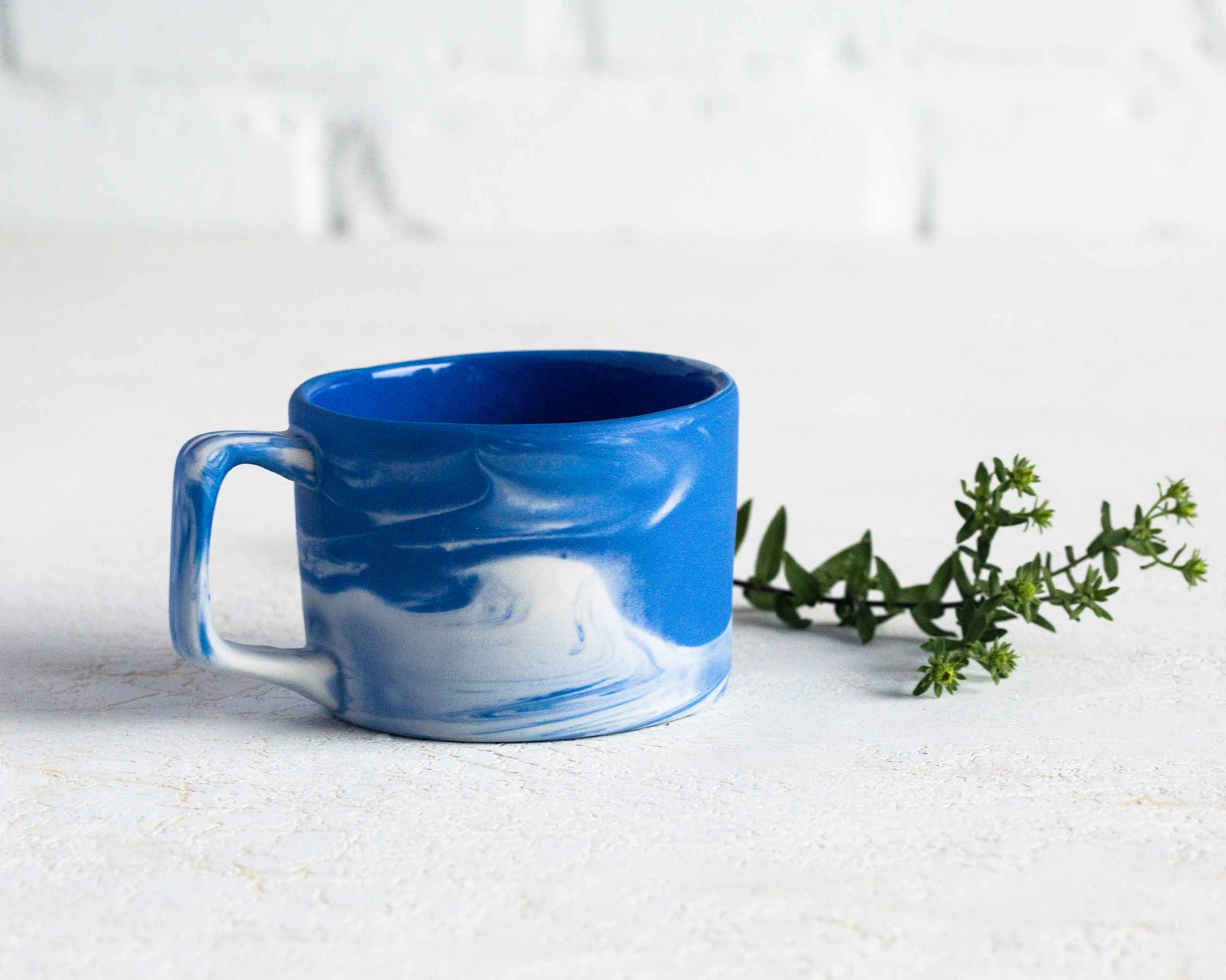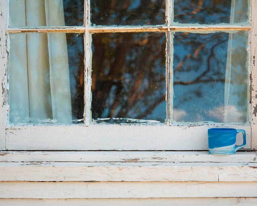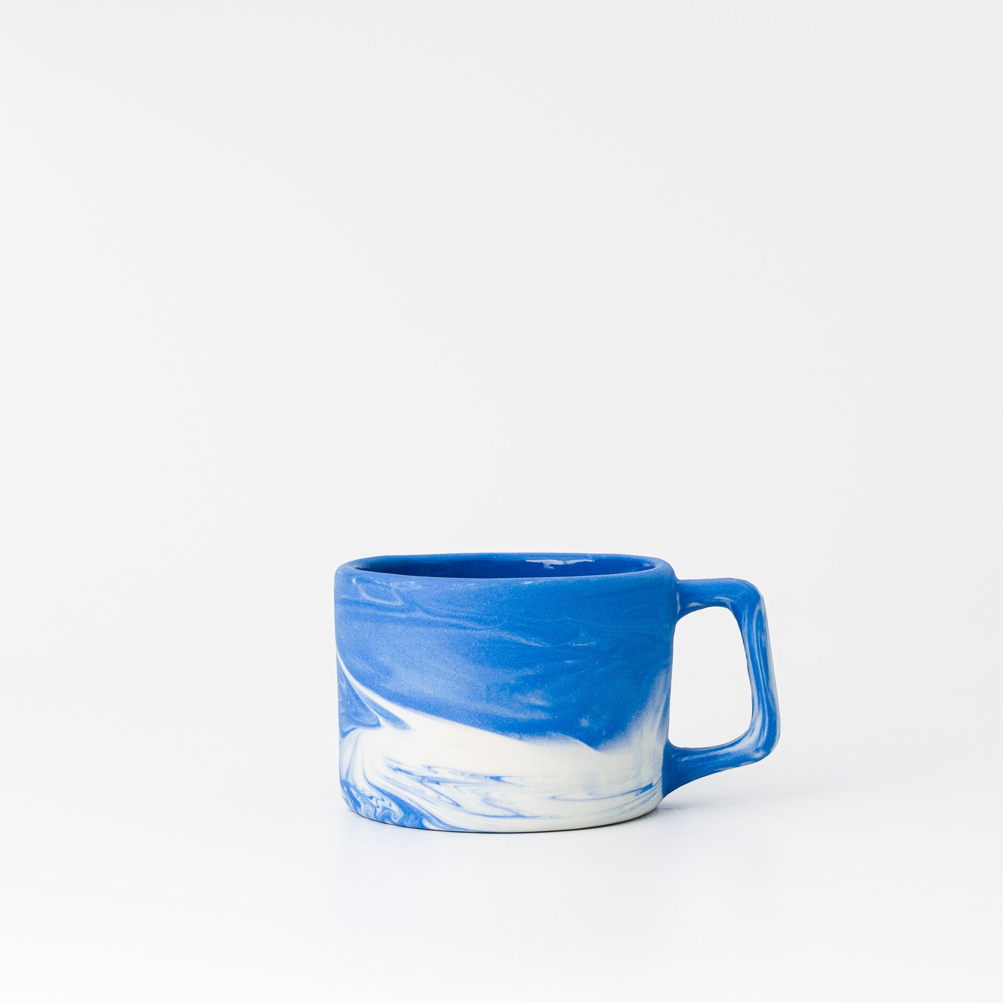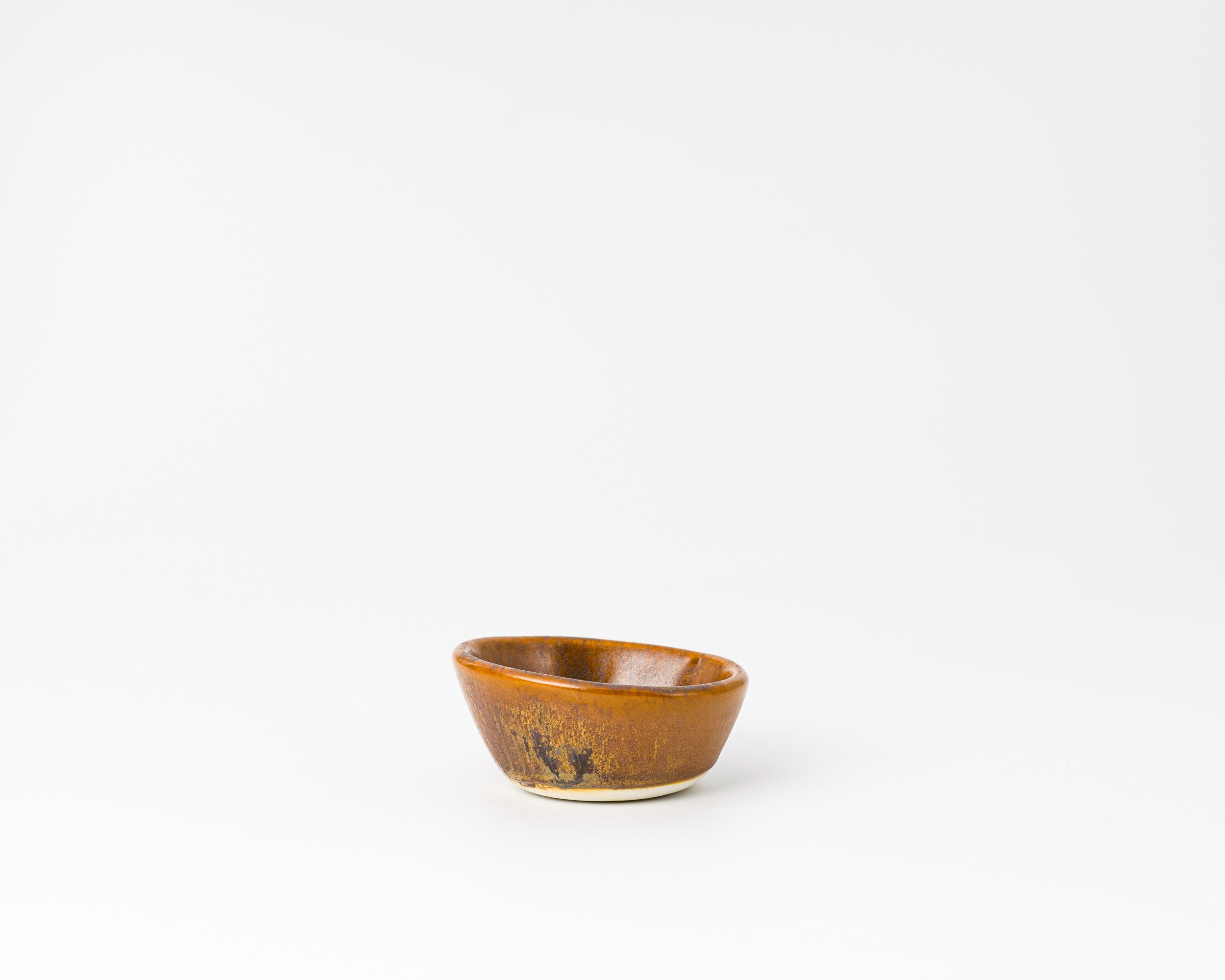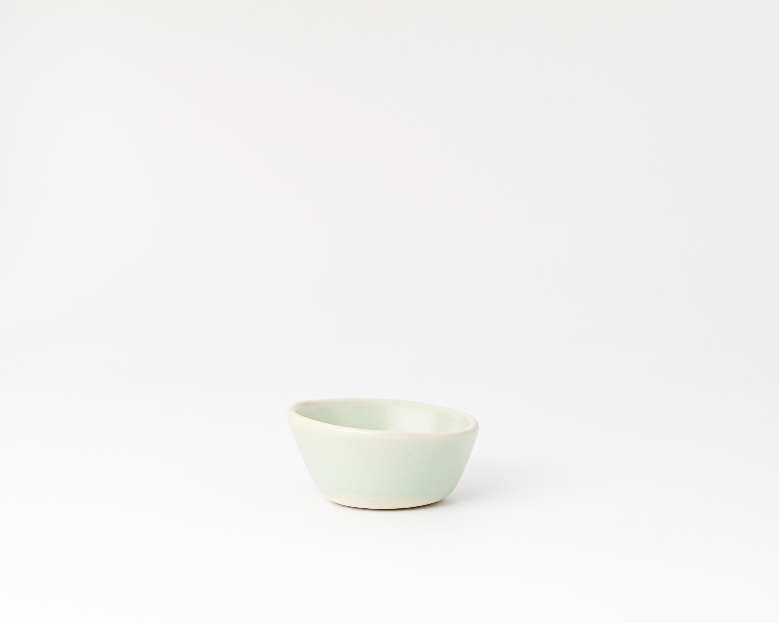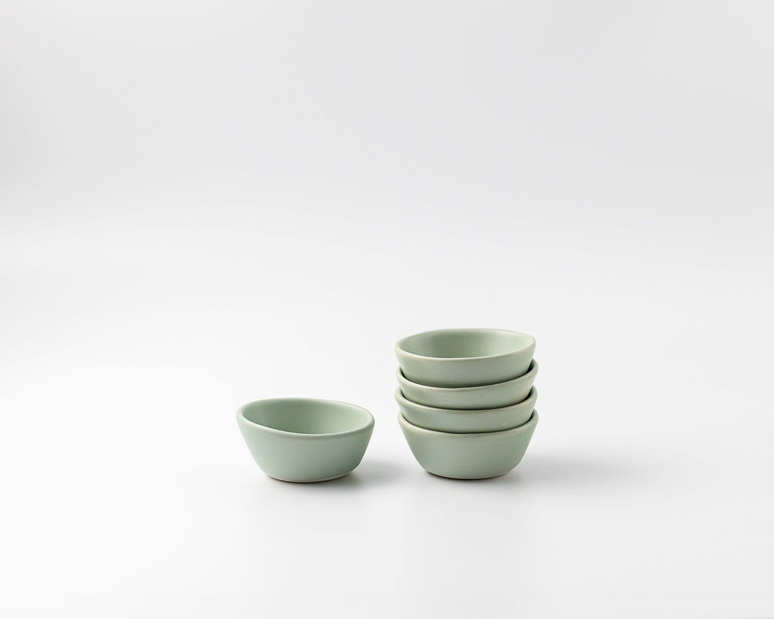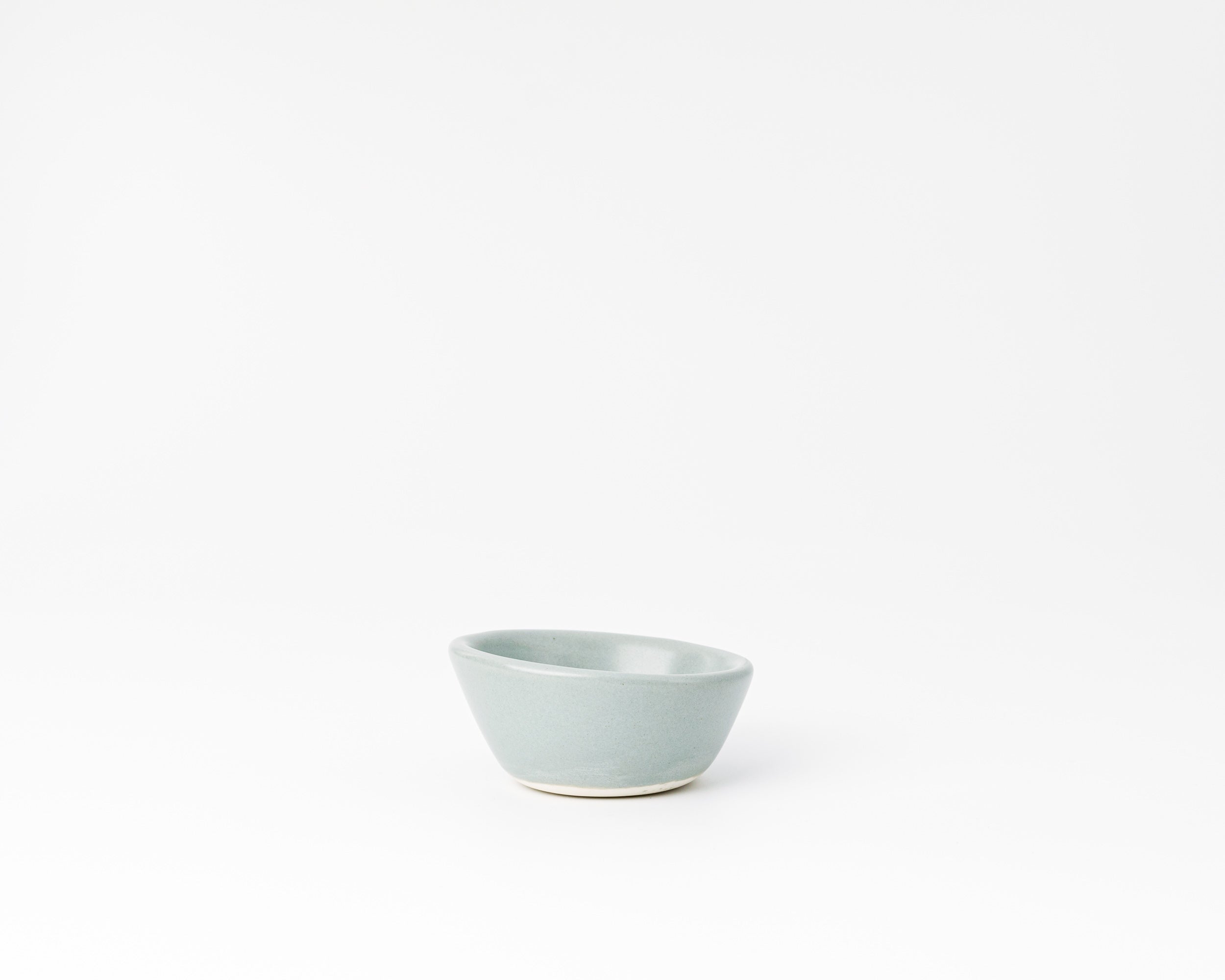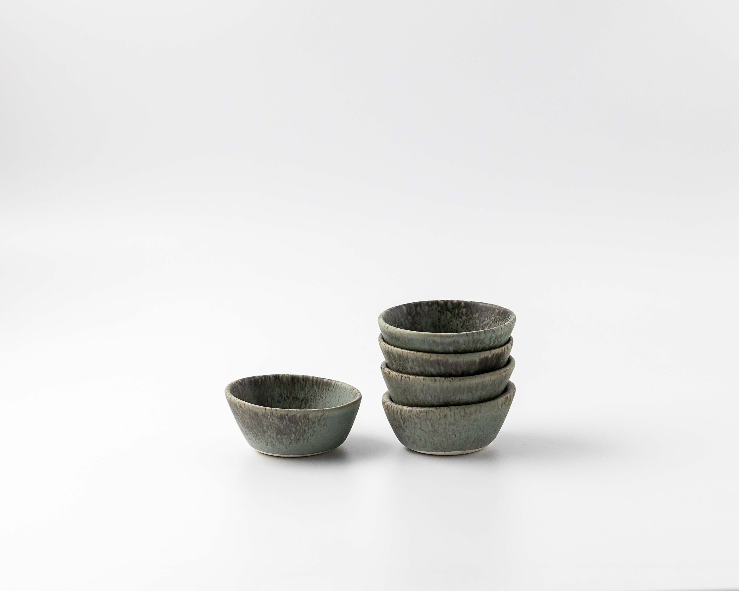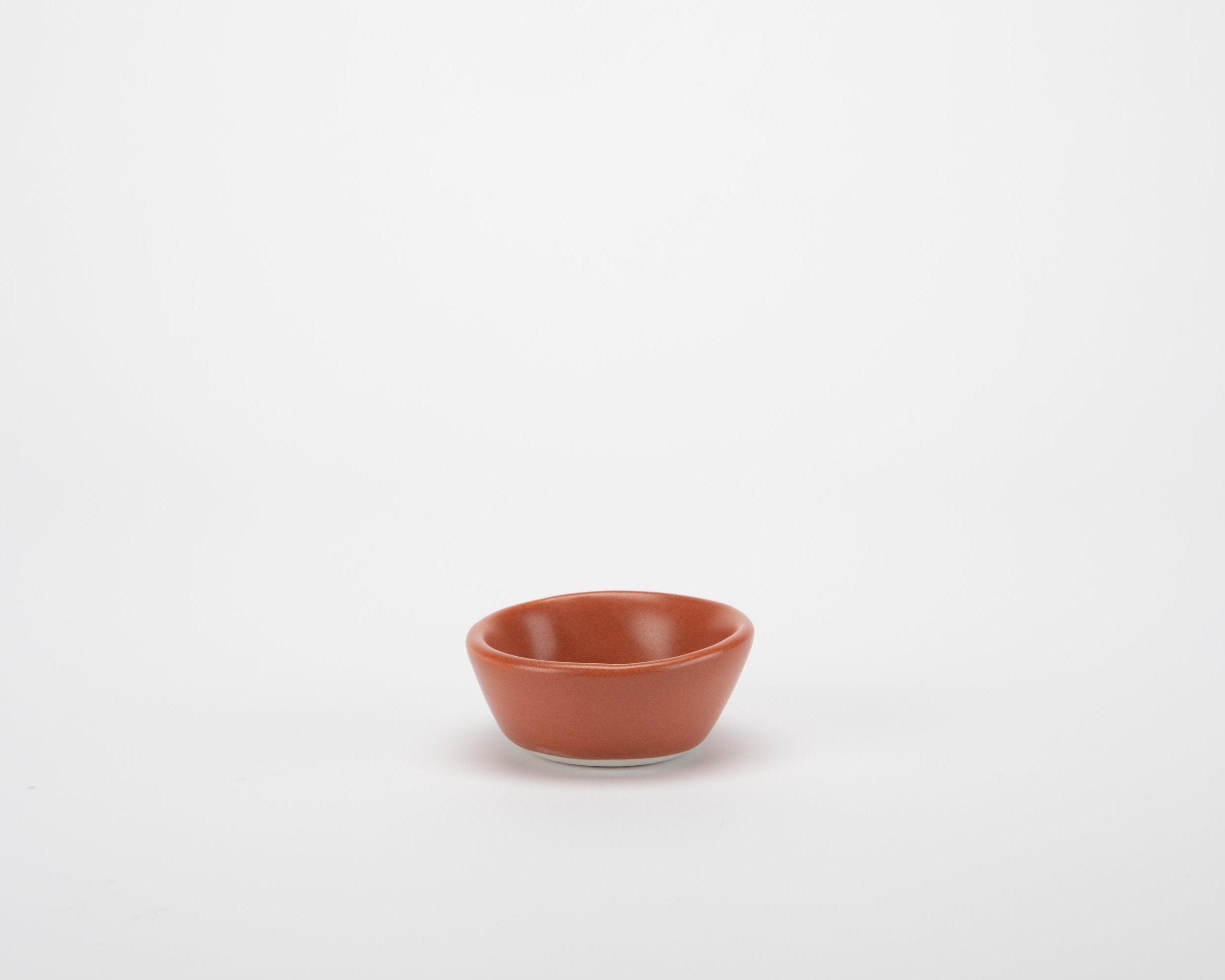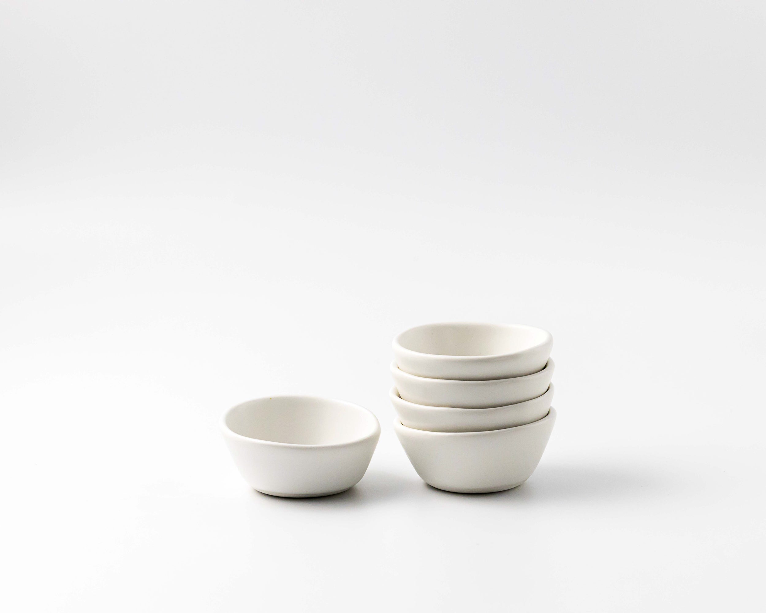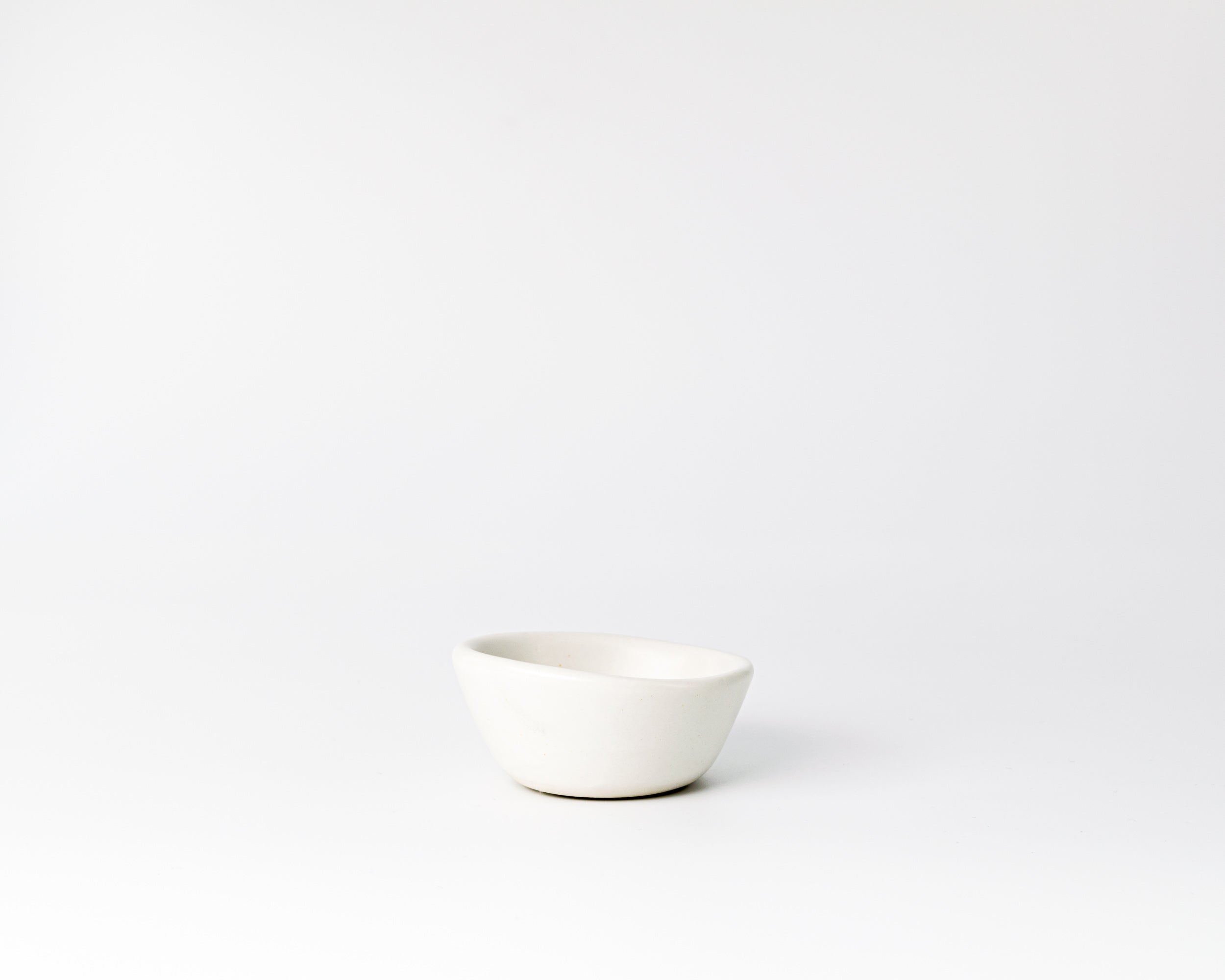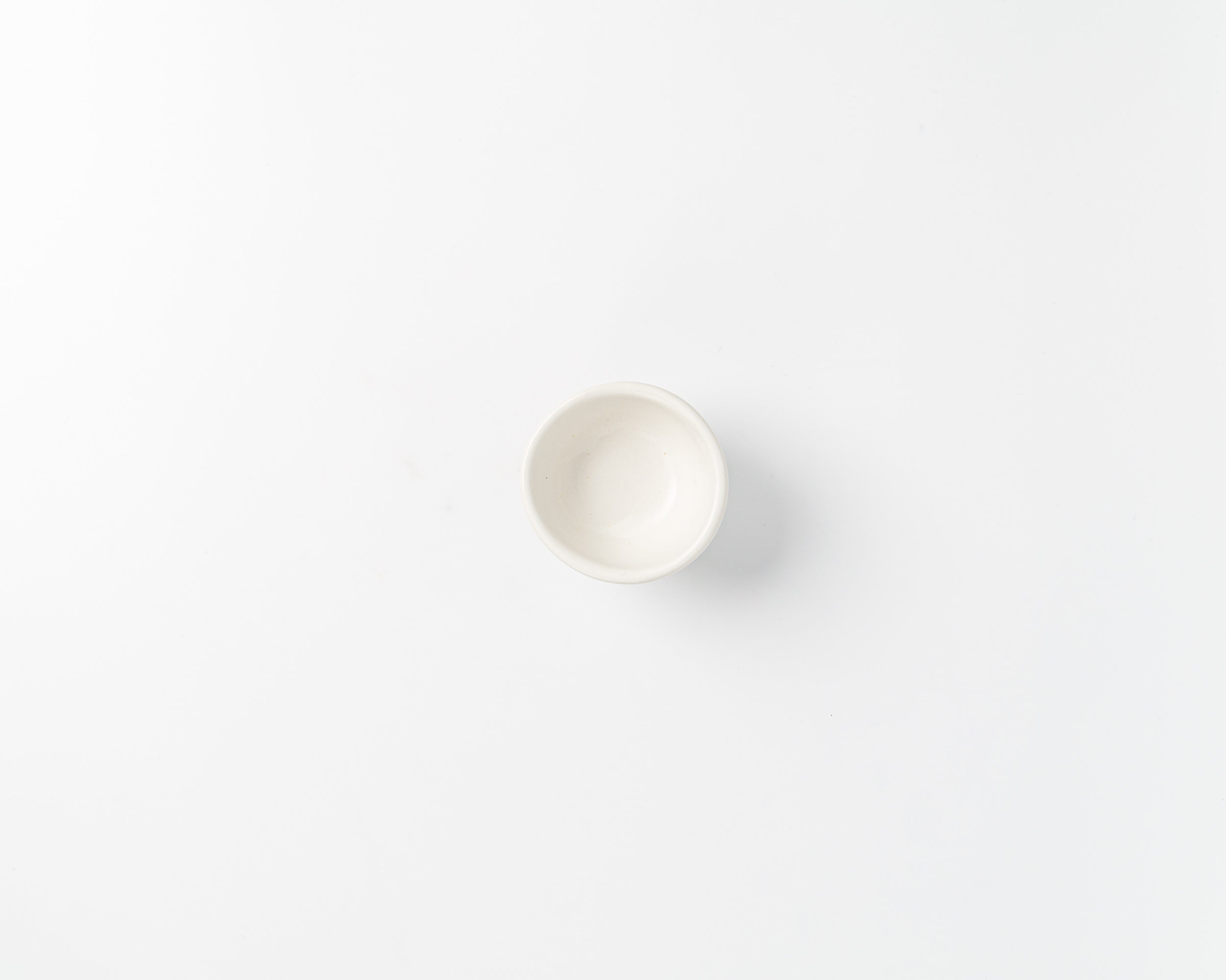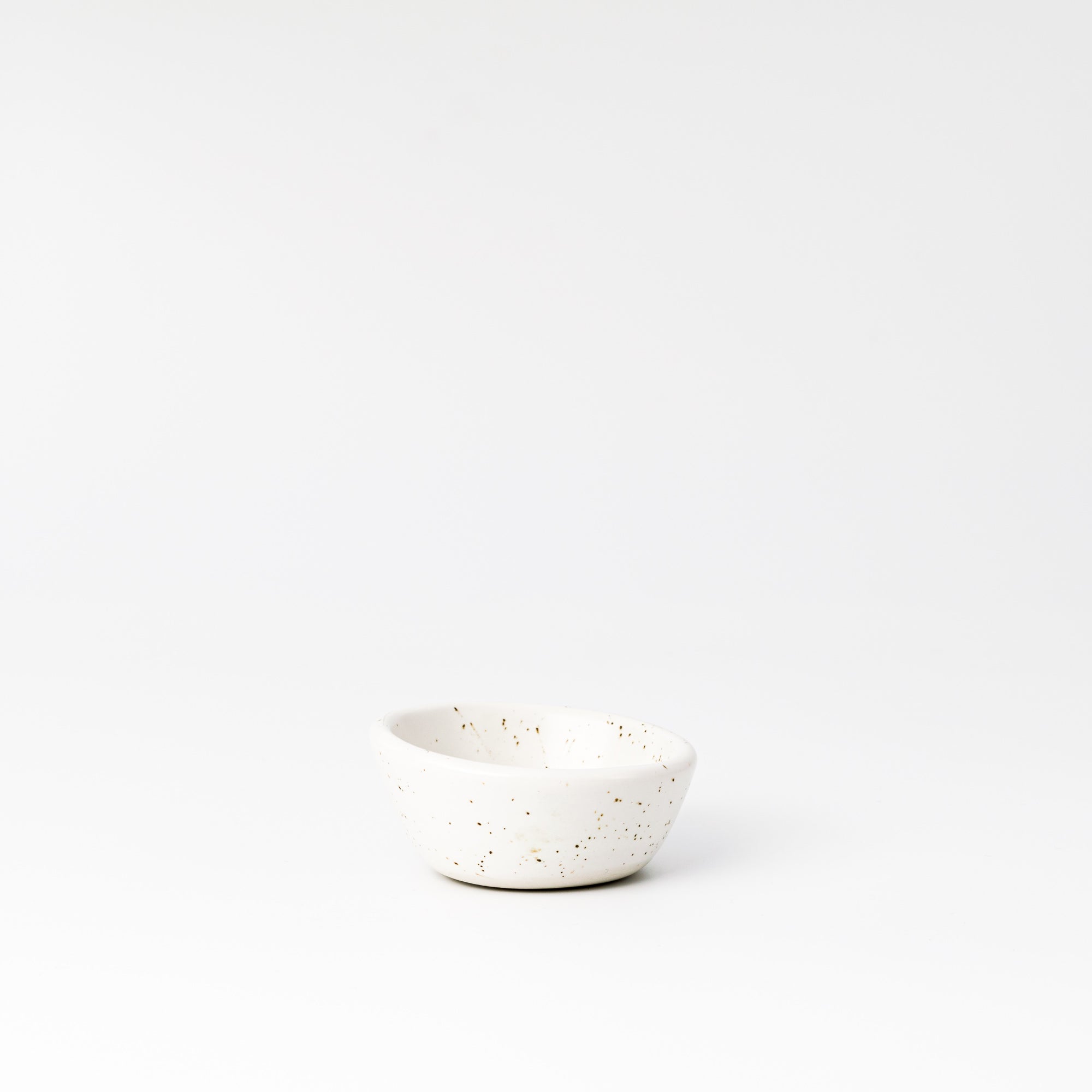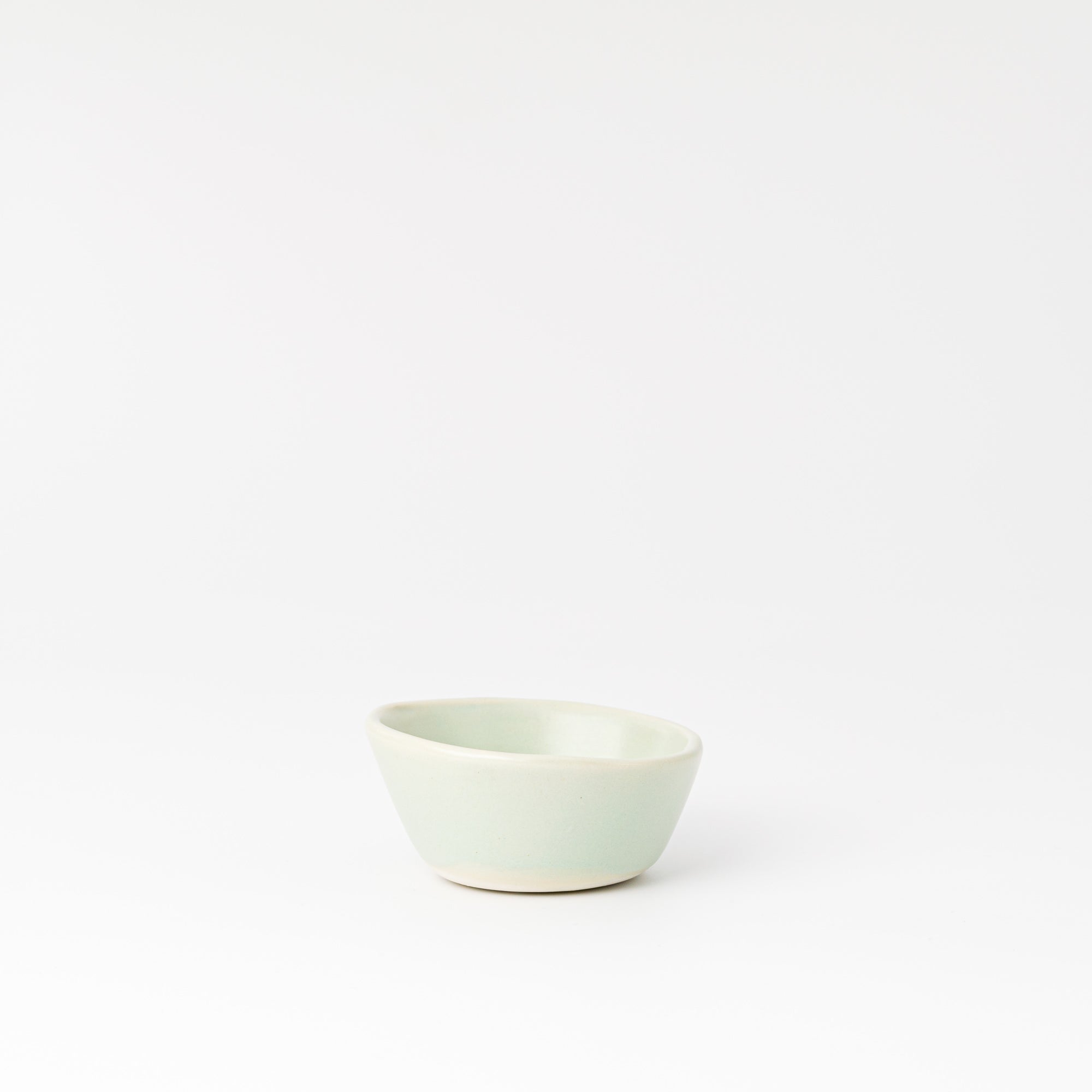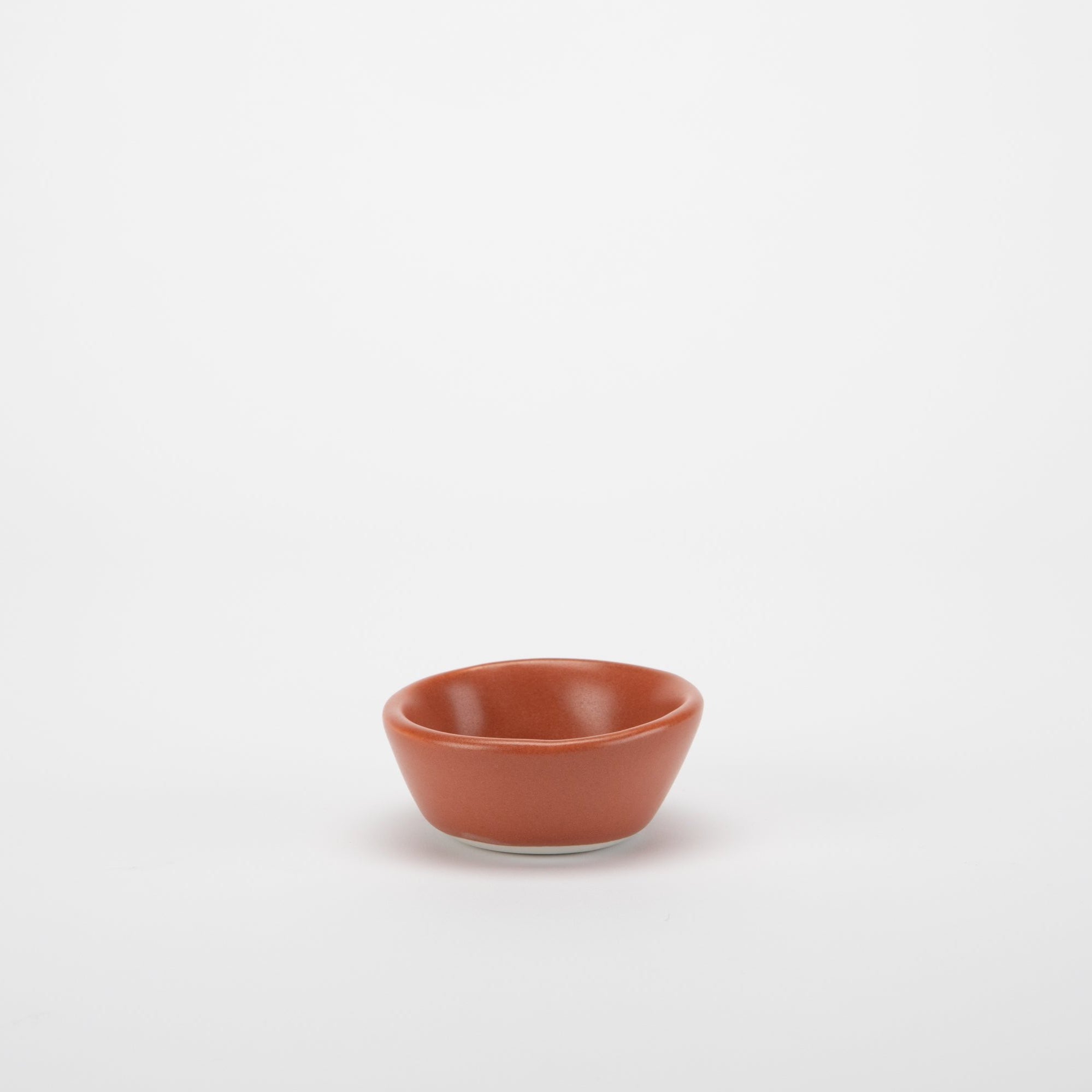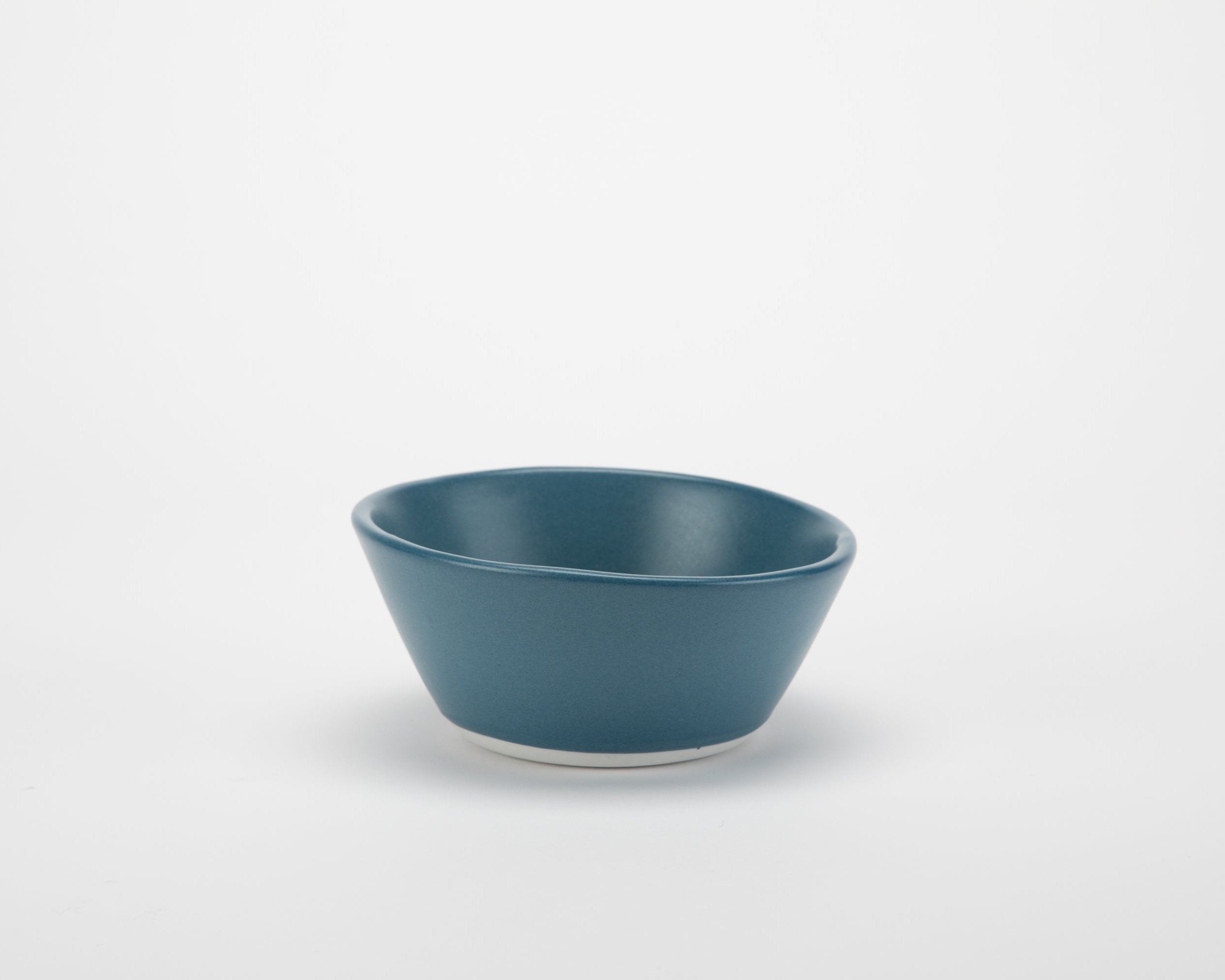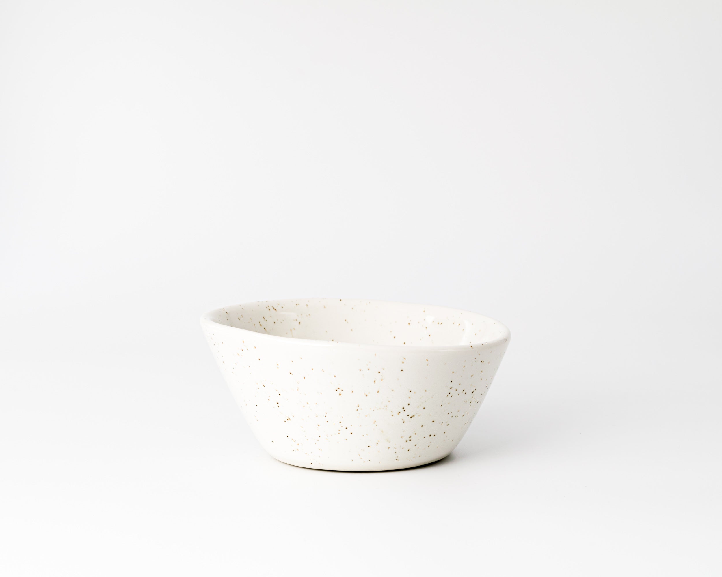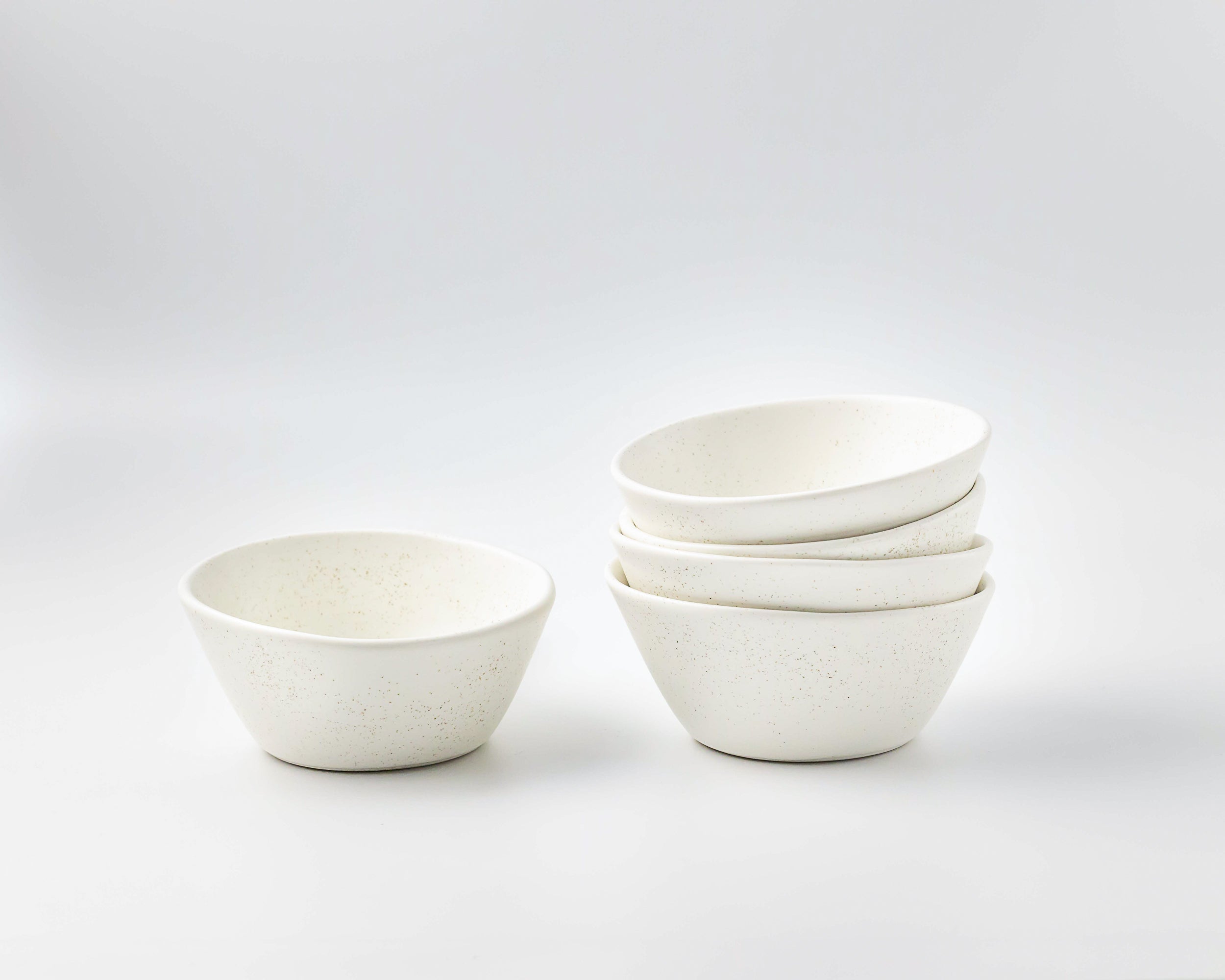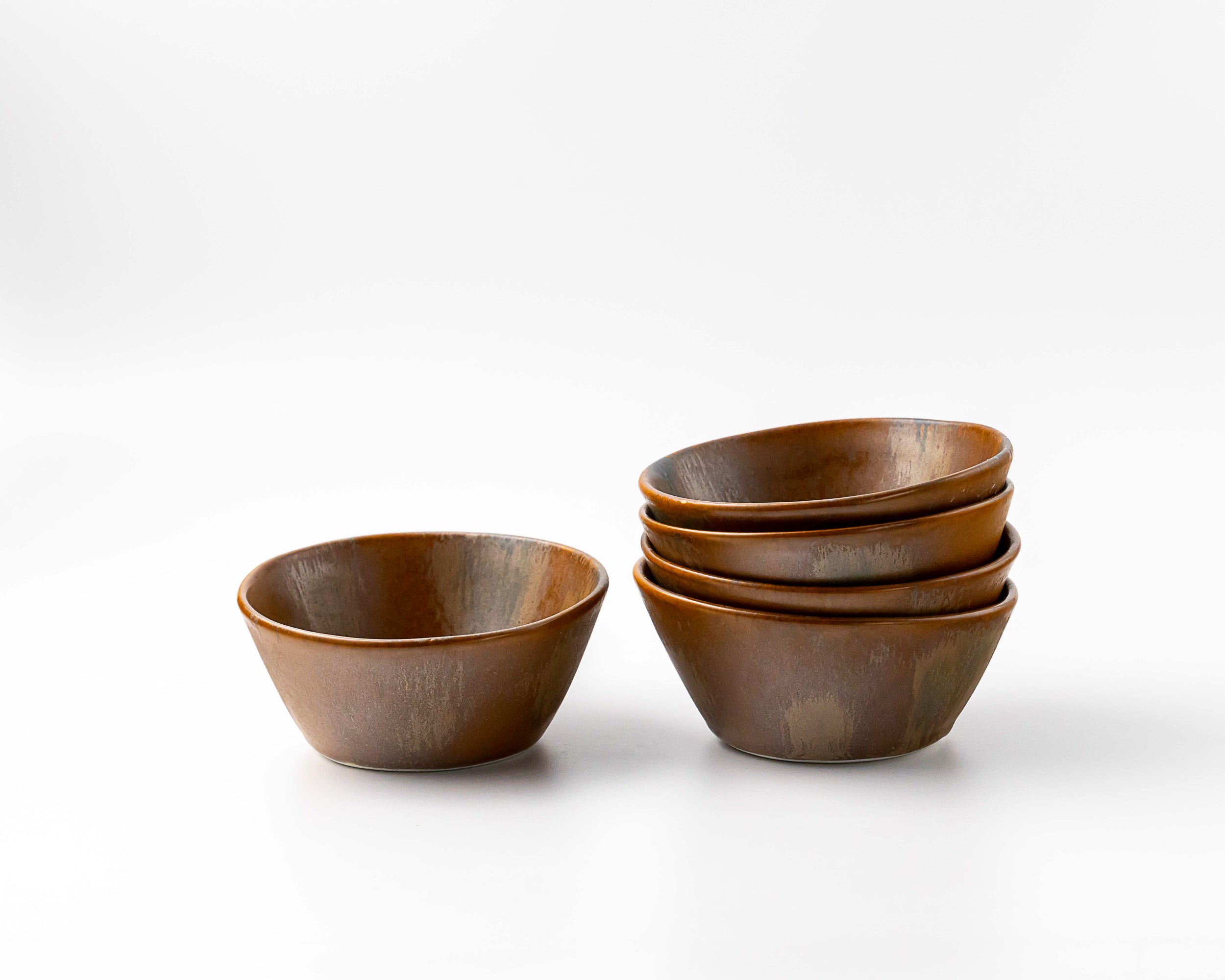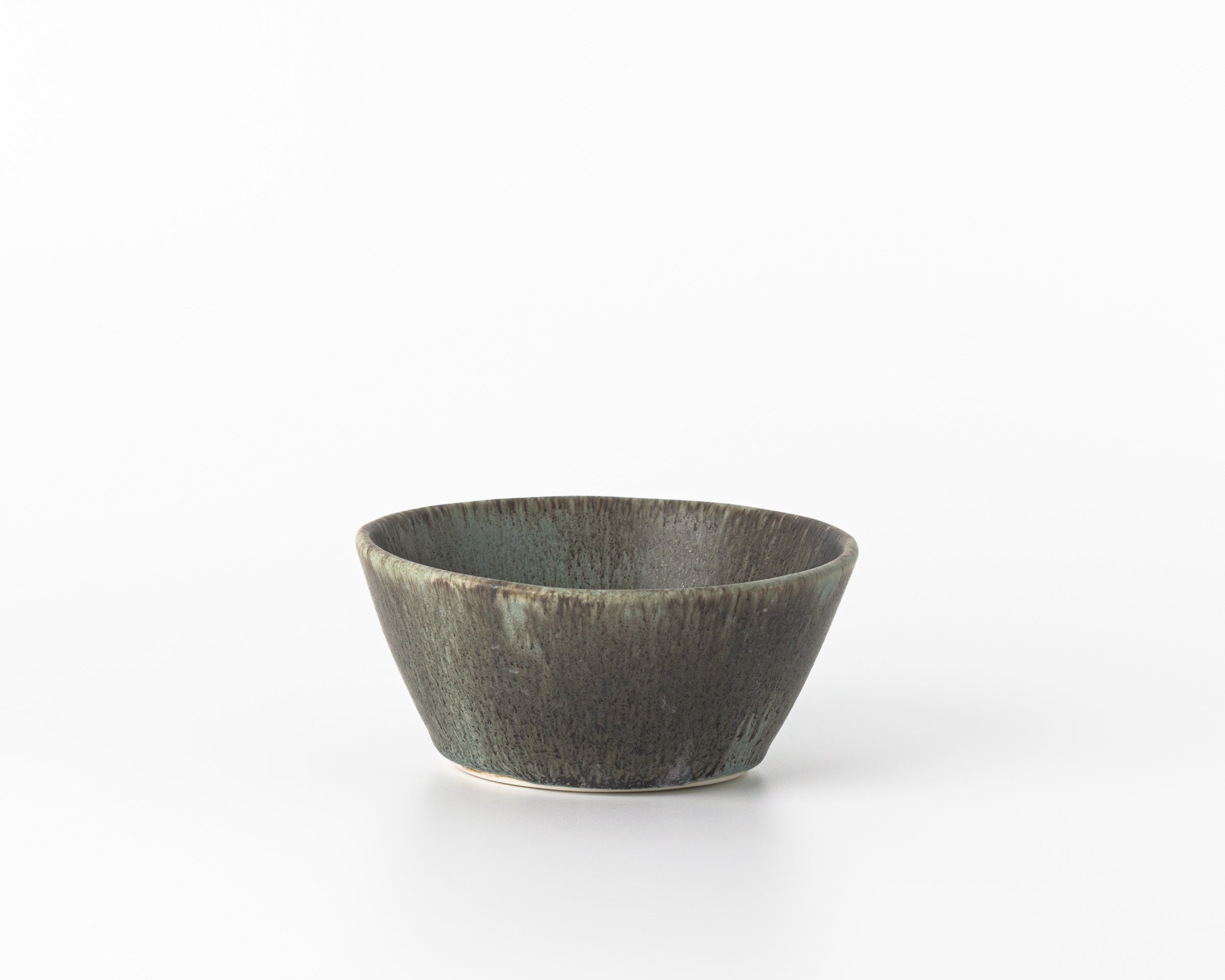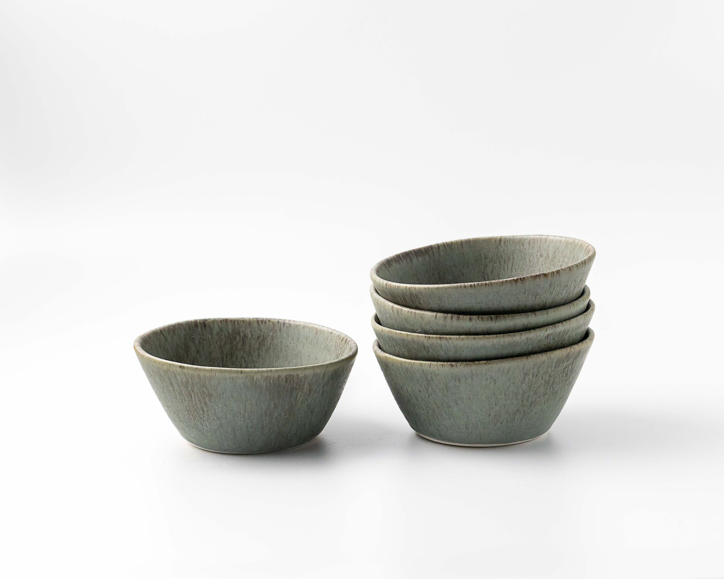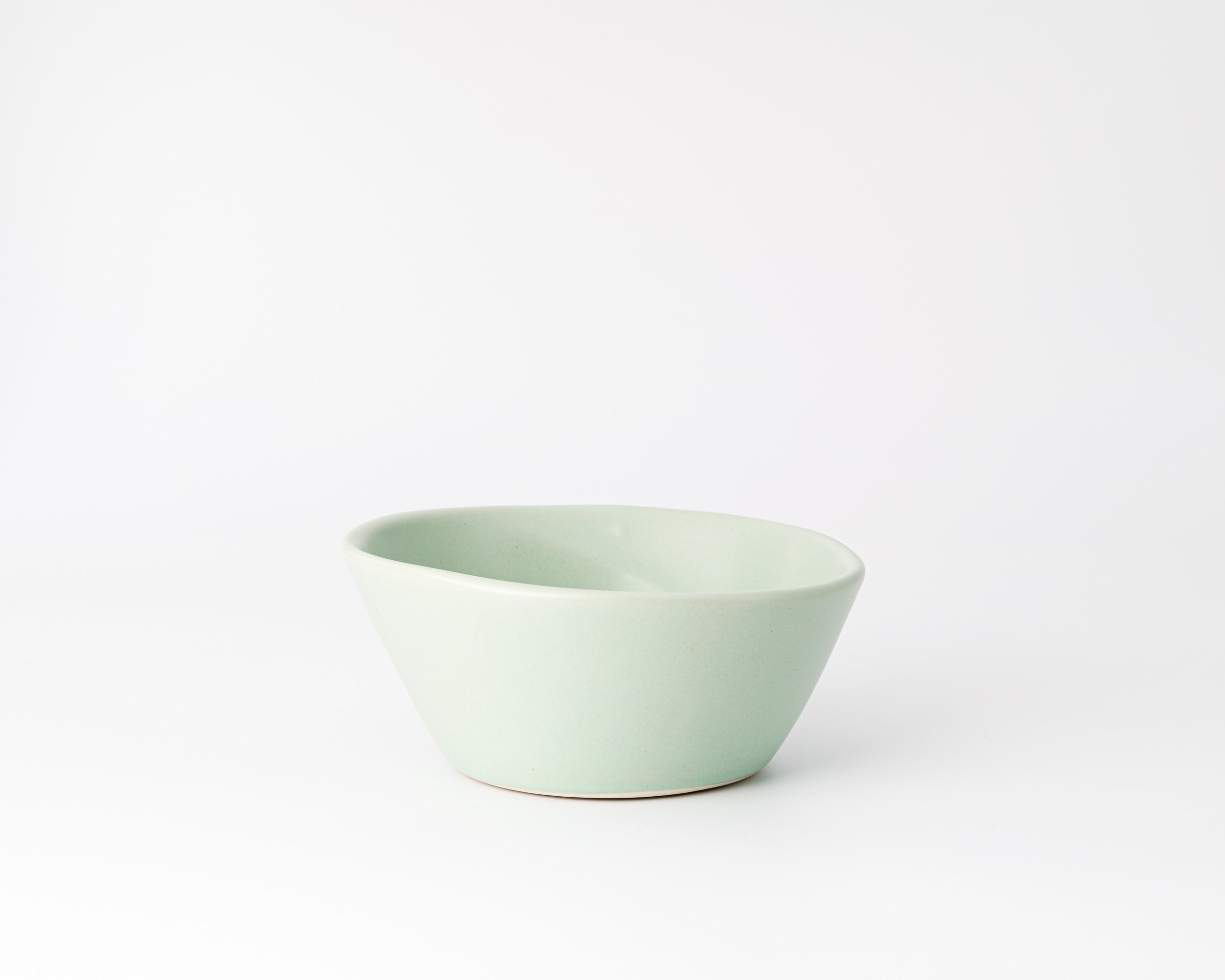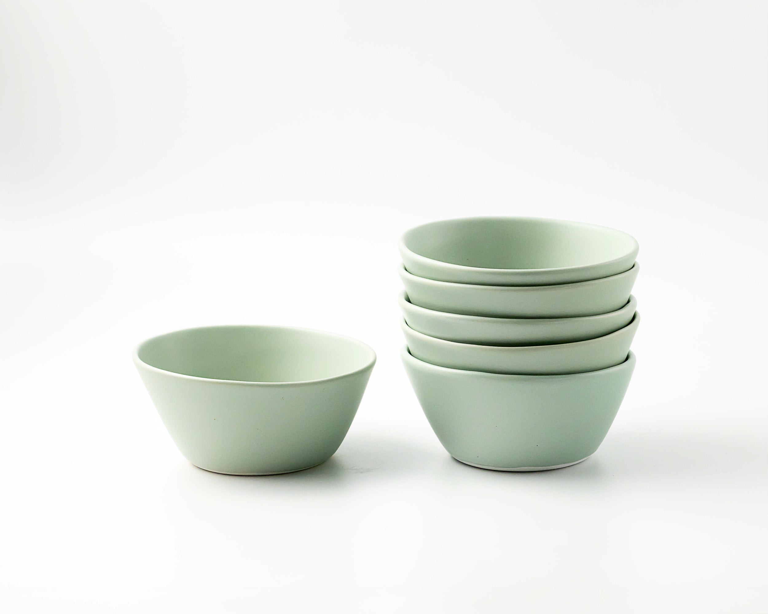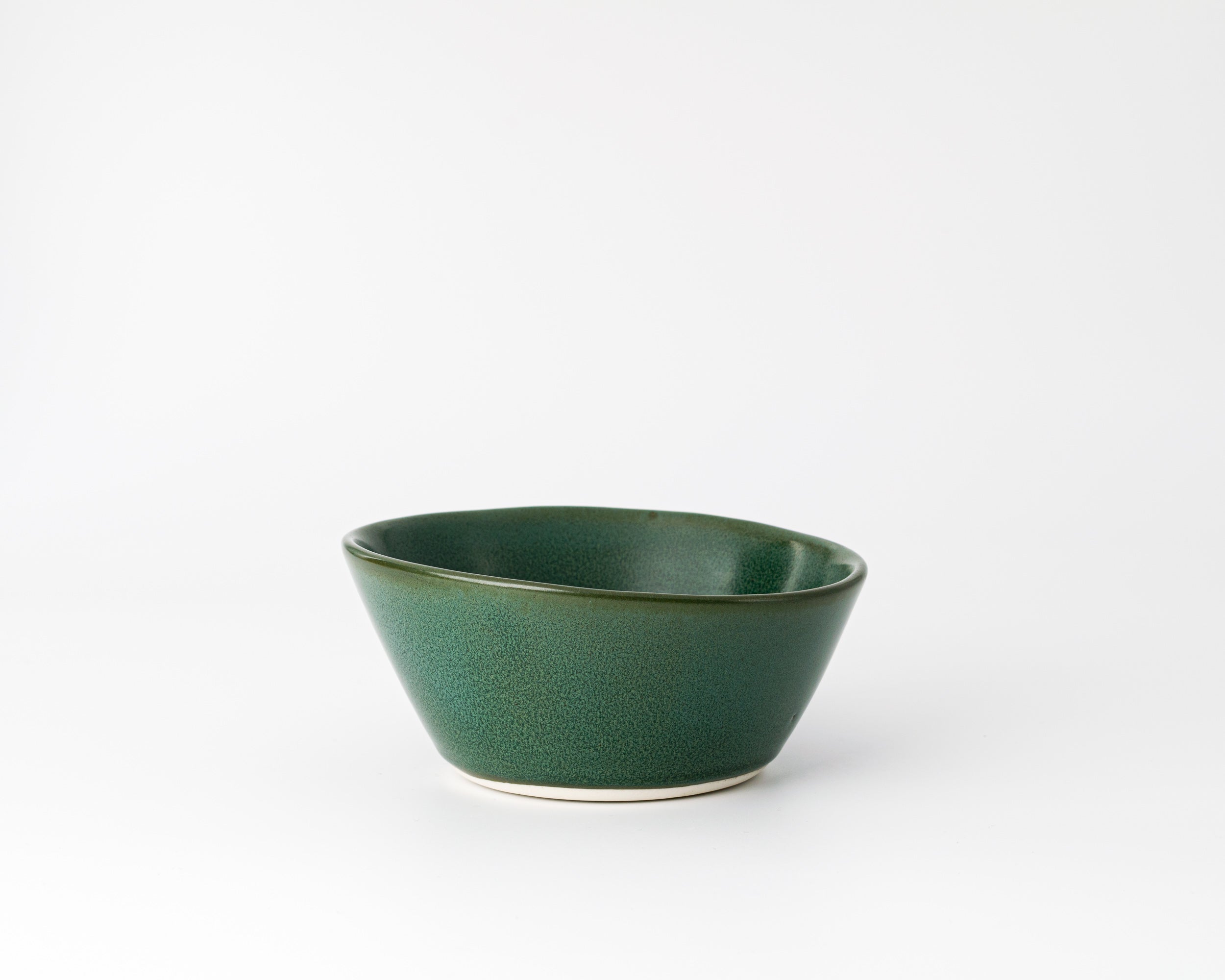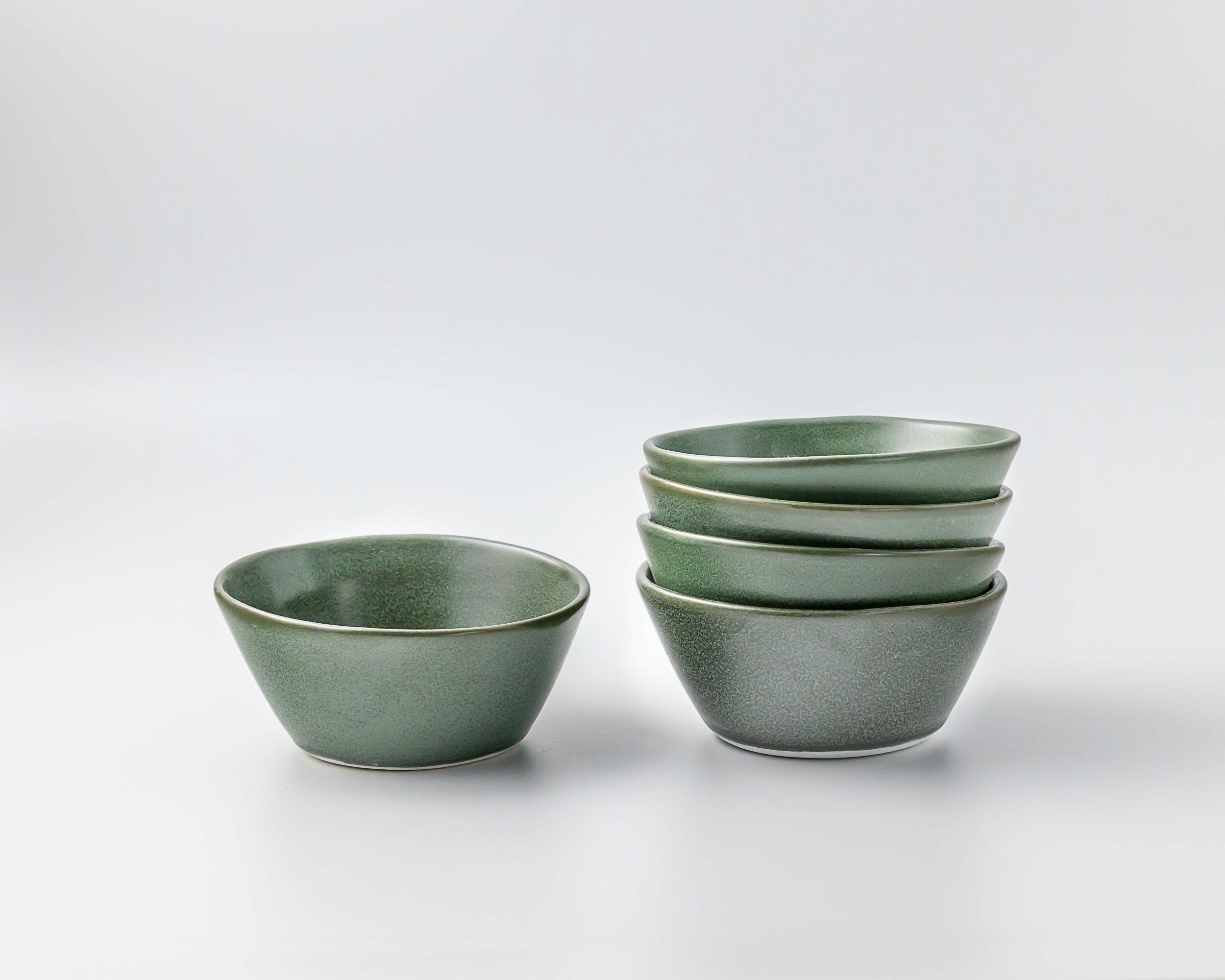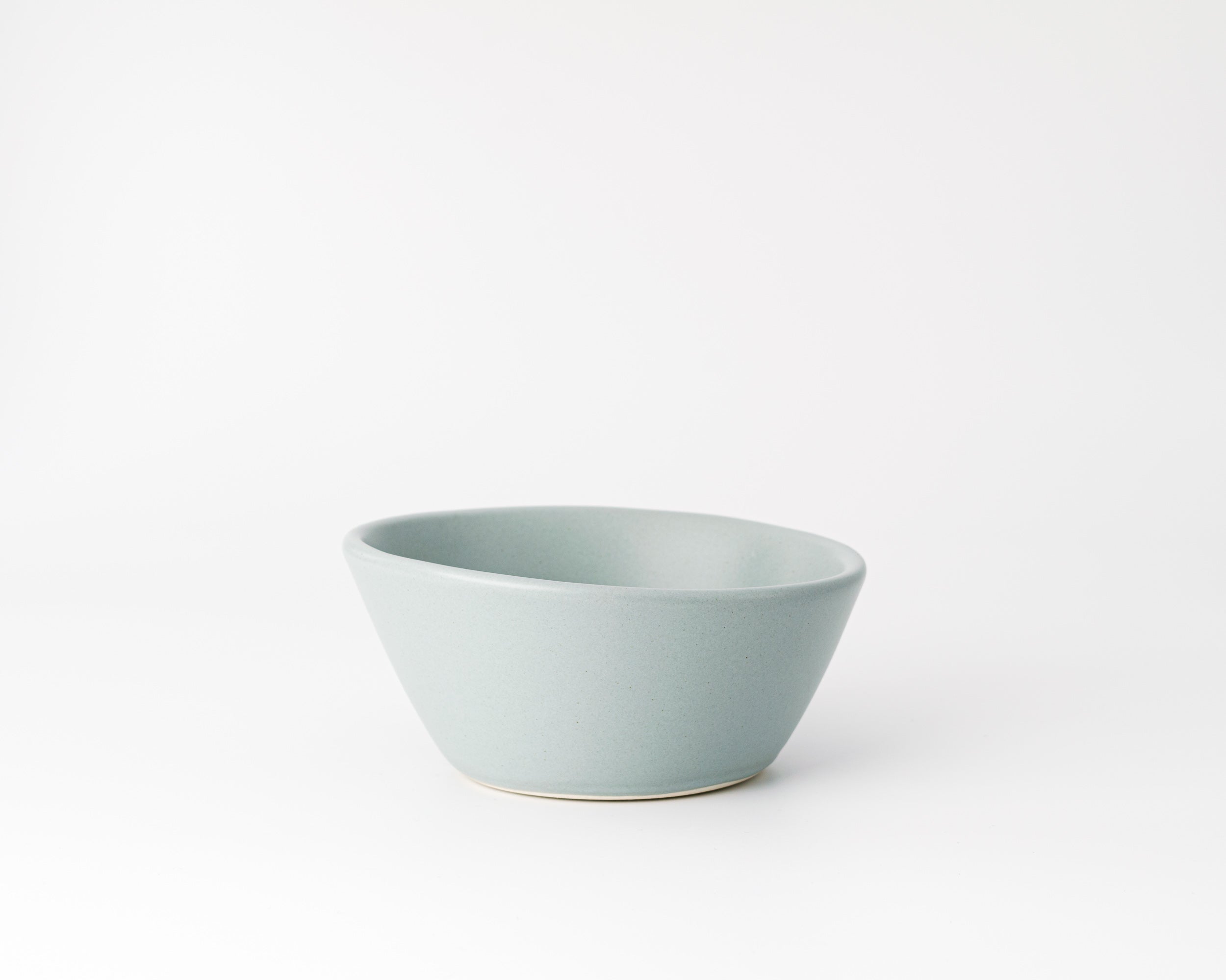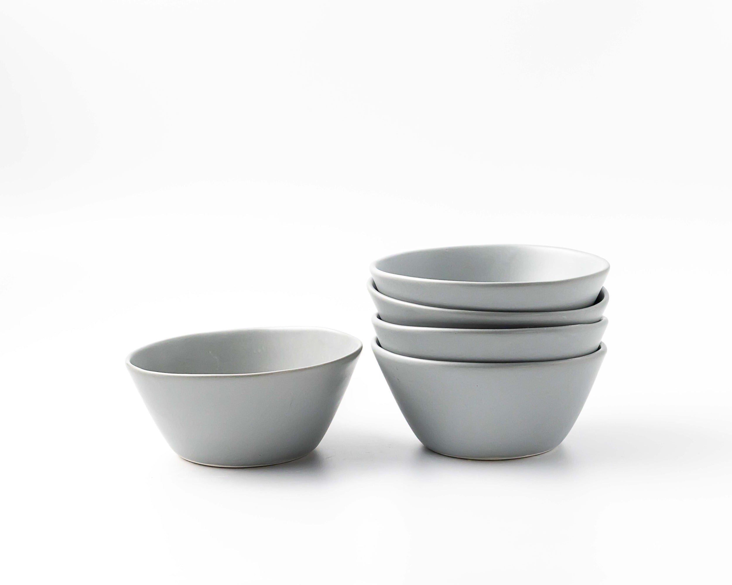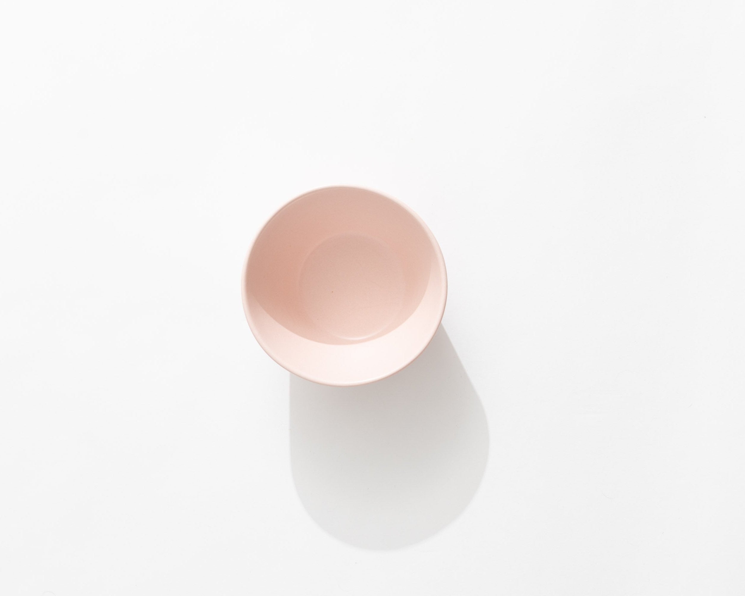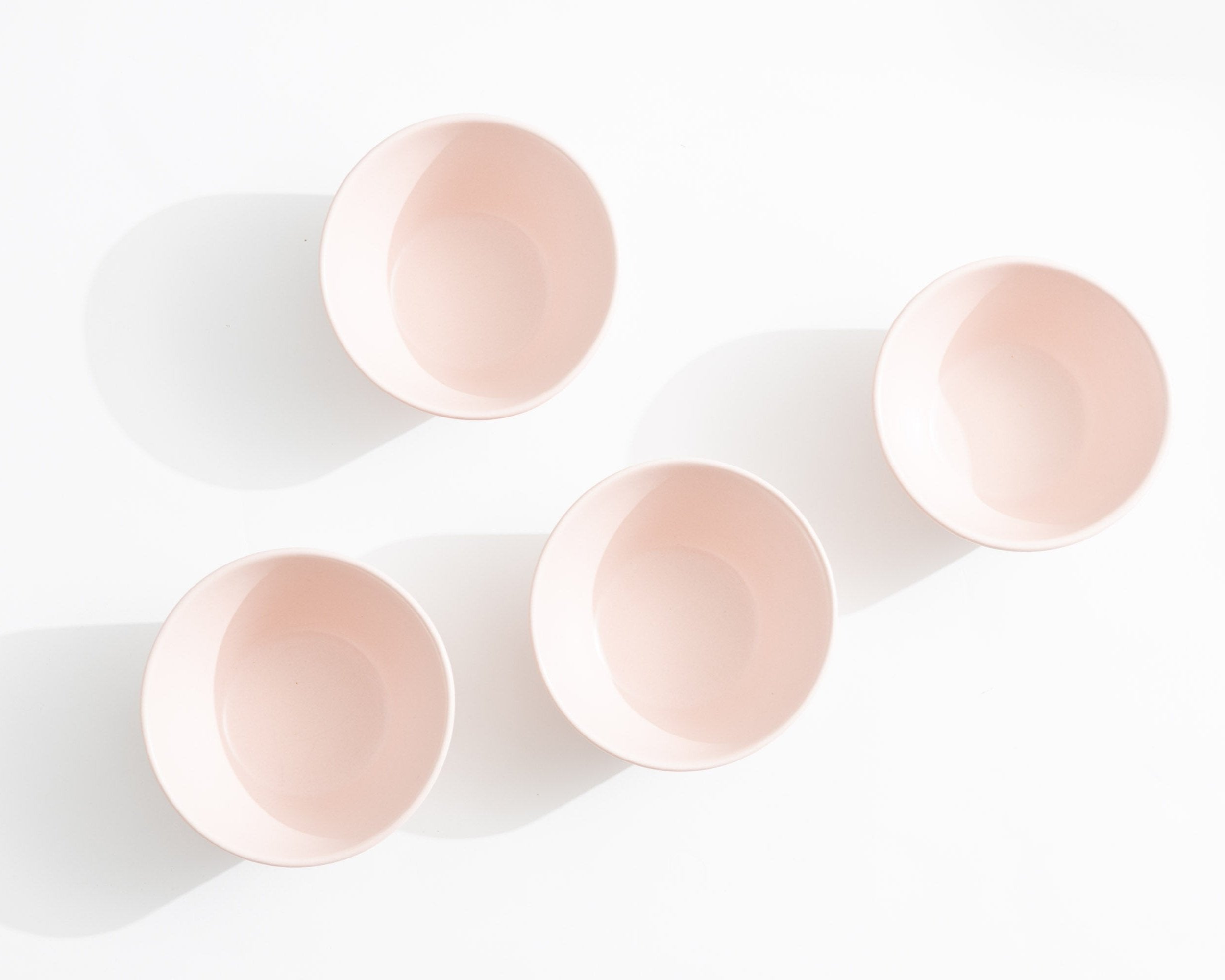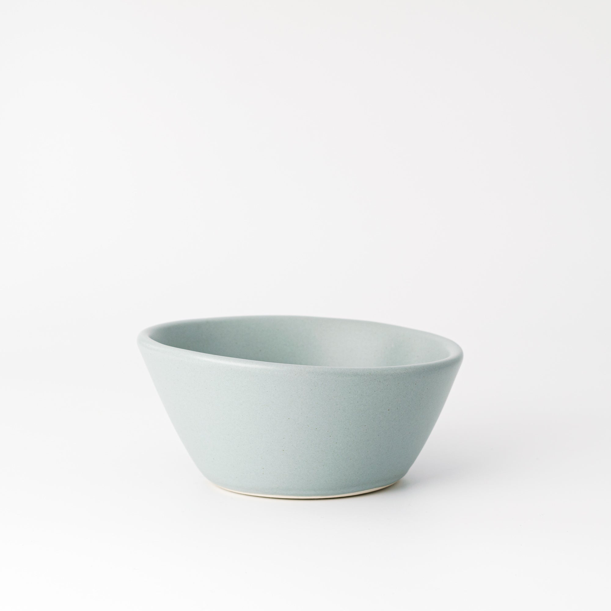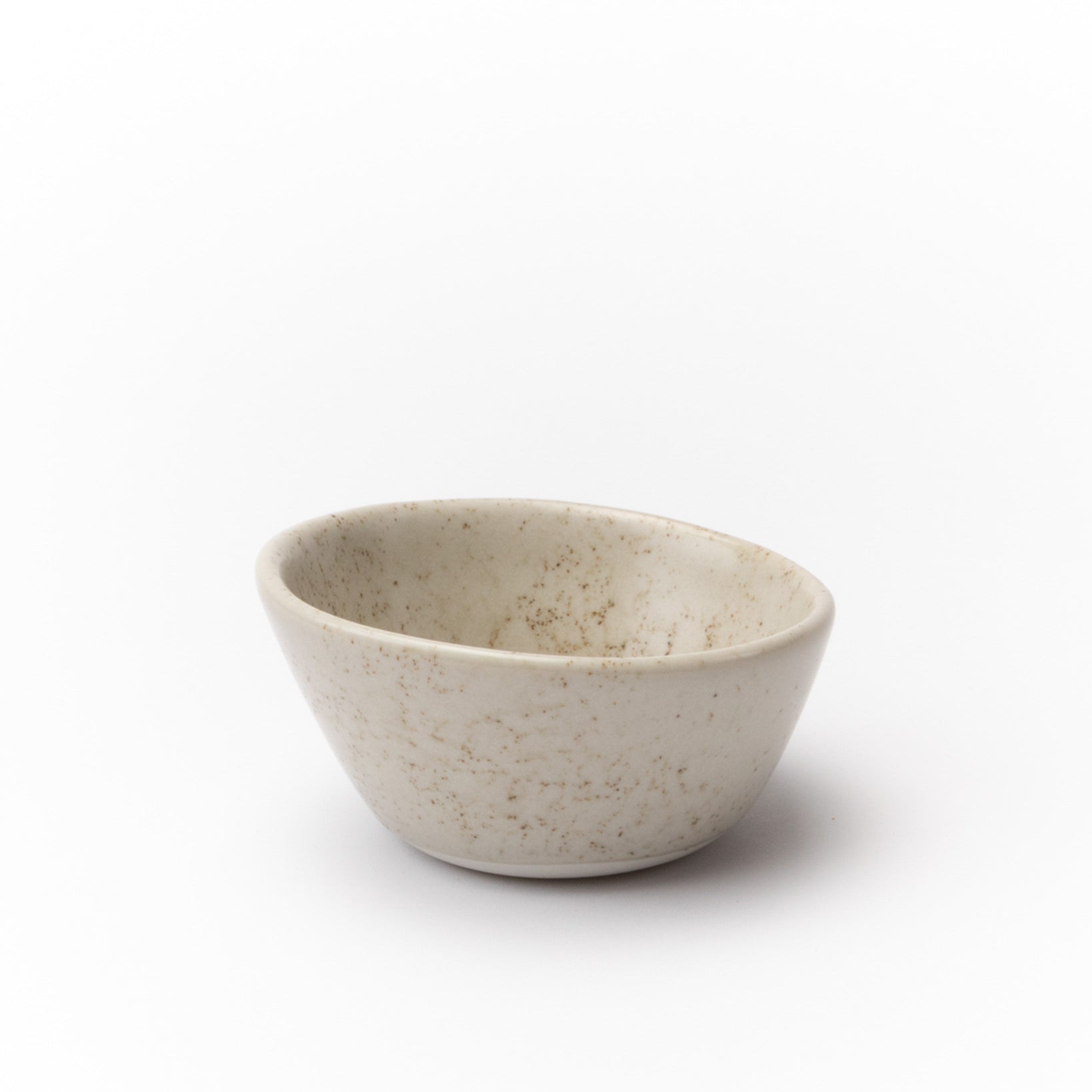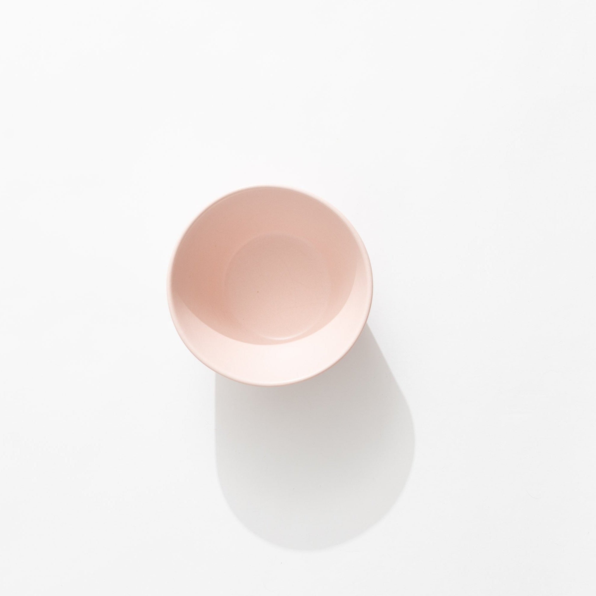
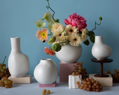
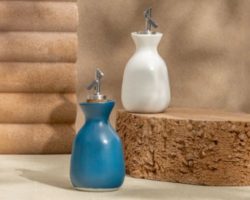
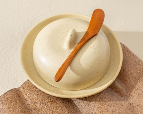


Making a pink glaze is tricky- we fire our ceramics to around 2,300 degrees Fahrenheit, and a lot happens from a physics/ chemistry standpoint at that temperature, you are basically creating a sped-up geological process in the course of a few hours. Suffice to say, matching intention to outcome takes some testing and finger crossing. So, when we talked about making a very specific pink color that Vivian wanted, I tried to temper expectations (pink is hard!) but internally I was elated: I love pink.
Maybe it was my childhood in Florida, with the sunrise on the beach hitting the sand and a faux Spanish mansion. I like a warm, soft pink and that was exactly what we were talking about. To make the color work, we pulled out all of the stops and the color we came up with is, in my opinion, perfect. It basically forces you to pick it up and feel it in your hands. The touchstones we talked about most were from the natural world- flowering tobacco (Nicotiana alata) native to eastern NC.
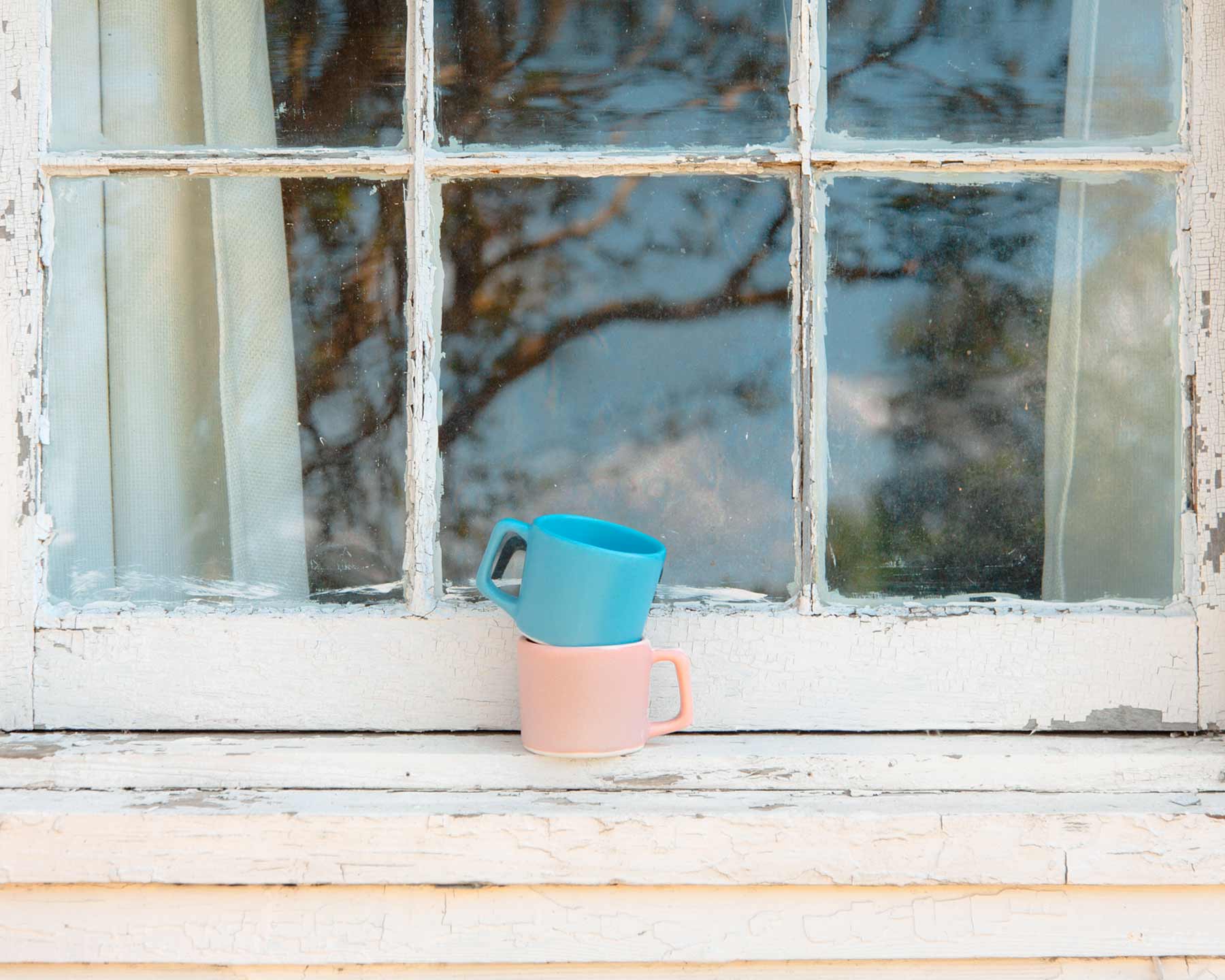
This glaze is something to behold, and best viewed in person. And even if you aren’t a “pink person”, I bet you will like this color, too. It’s not a trendy shade of pink, it’s one that will look in style decades from now. The name, Buttermilk Pink, is all Vivian, and like any good color name, it’s almost a haiku- I imagine a fresh pail of milk catching the reflected pink of sunrise and a farmer pausing to reflect on the beautiful way a quotidian thing can become sublime and extraordinary in the right light. -Mark